
Have you ever tried to click a tiny button on your phone only to end up on the wrong page? It is a common frustration. You are likely reading this on a handheld device right now. If the text was too small to read or the images took forever to load, you would have left this page already. This is why a mobile first design strategy is no longer just a luxury for businesses. It is the baseline for staying relevant.
What Is Mobile First Design (and Why It Matters Today)
Mobile first design is a method where you build the smallest version of your site before anything else. Instead of starting with a large desktop screen and trying to shrink it down to fit a phone, you start with the mobile view. This forces you to focus on the most important content because space is limited.

Understanding the Mobile First Concept and responsive web design
In the field of web design and development, the goal is to make sure your site looks good on every screen size. This is often called responsive web design. In the past, designers built for computers first and then removed features to make the site work on phones. Mobile first flips that logic. You decide what is most important for a user on a small screen first. Once that foundation is solid, you add more features for tablet and desktop users.
Mobile First vs. Mobile Friendly Websites
A mobile friendly site is often a desktop site that has been squeezed or shrunk to fit a phone. These sites usually feel clunky. You might have to zoom in to read the text, and menus often behave poorly. A mobile first website design is built specifically for the palm of your hand. It focuses on thumb movements and vertical scrolling from the very beginning. It is the difference between wearing a suit that was tailored for you and one that was pinned back to sort of fit.
Aspect | Mobile Friendly | Mobile First |
Design Approach | Desktop-first, scaled down | Mobile-first, scaled up |
User Experience | Clunky navigation, zoom required | Thumb-friendly, intuitive flow |
Performance | Often slow on mobile networks | Optimized for speed from start |
SEO Impact | Risks poor mobile indexing | Boosts Google mobile-first rankings |
Best For | Quick fixes on legacy sites | New builds or full redesigns |
How Mobile Devices Have Changed User Behavior
We do not browse the internet the way we used to. We use our phones while waiting for coffee or sitting on a bus. This means we have shorter attention spans and much higher expectations. We want answers fast and we want them without having to hunt through complex menus. If a site does not deliver in seconds, we move on to a competitor.
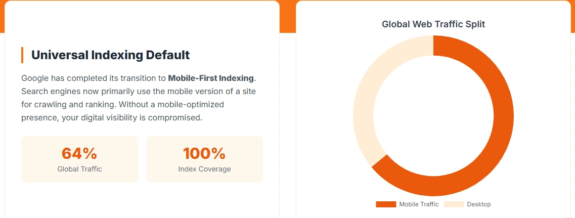
Metric (2025 Projections) | Global | Egypt | Source |
Mobile Internet Traffic Share | 62% | 78% | Statista/GSMA |
Smartphone Penetration | 85% of adults | 92% of adults | GSMA Intelligence |
Avg. Daily Mobile Usage | 4.8 hours | 5.2 hours | DataReportal |
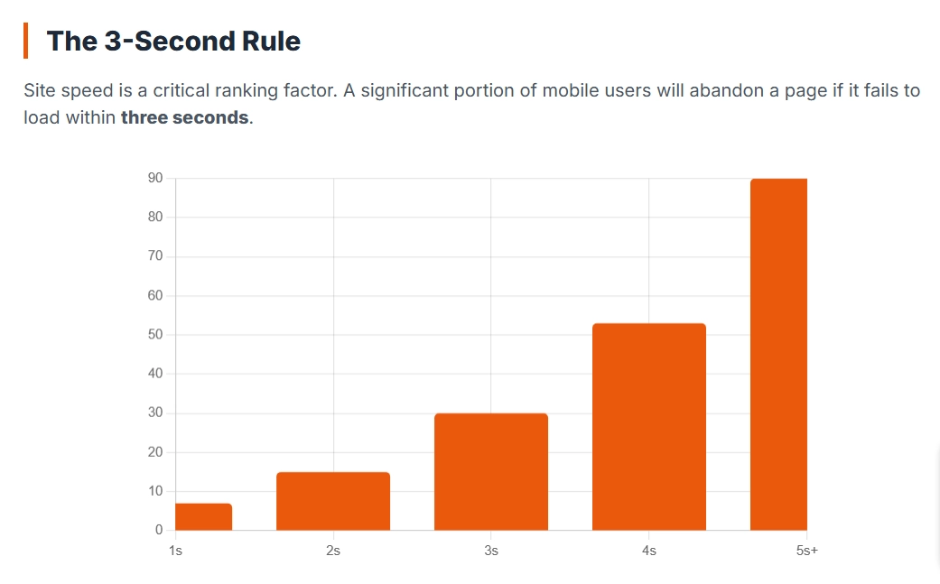
Bounce Rate on Slow Mobile Sites | 53% in 3s | 61% in 3s | Google/Web.dev |
The Business Case for Mobile First Design
Businesses often ask if the effort of a mobile first approach is worth the cost. The answer is usually found in your sales data and customer feedback.

Boosting Conversions and Engagement
A site that is easy to use on a phone sells more products. When you remove the friction of tiny buttons and long forms, users stay longer. If a customer can complete a purchase with one hand while walking, your sales will likely increase. This is why website design and development services now focus so heavily on the mobile checkout process.
Enhancing User Experience and Satisfaction
Satisfaction comes from a site that just works. When your site responds instantly to a touch and the layout is clear, users feel in control. This builds trust with your brand. People enjoy using tools that do not make them work hard to find information.
Driving More Mobile Traffic and Retention
Most of your traffic is already coming from mobile devices. If those visitors have a bad experience, they will not return. A custom web design that focuses on the mobile user ensures that your first impression is a strong one. Retention is about making the experience so smooth that the user has no reason to look elsewhere.
Key Benefits of Mobile First Design
Why should you care about the order in which your site is built? The benefits go beyond just looking good on a phone. It actually changes how the internet perceives your business.
Faster Page Speed and Improved Performance
A mobile first design strategy forces you to be lean. Because mobile networks can be slower than home wifi, you cannot afford to have huge, heavy images or unnecessary scripts running in the background. When you build for the phone first, you prioritize speed. According to research from various web performance studies, even a one second delay in loading time can lead to a significant drop in visitors. By keeping the site light, you ensure that every user gets a fast experience, regardless of their connection.
Better SEO Rankings and Visibility
Search engines like Google now use mobile first indexing. This means the search engine looks at the mobile version of your site to decide where you should rank in search results. If your mobile site is difficult to use or slow, your rankings will suffer even if your desktop site is perfect. Effective web design and development must prioritize the mobile experience to ensure your business remains visible when people search for your services.
Future Proofing Your Website Across Devices
New devices are released every year, from folding phones to smart watches. When you use responsive web design that starts with the smallest screen, it is much easier to scale up to new technology. You are building a flexible foundation. Instead of constantly playing catch up with new screen sizes, a mobile first approach ensures your site is ready for whatever device comes next.
Benefit | Impact Statistic (2025) | Why It Matters |
Faster Page Speed | +24% conversion per 1s faster load | Retains users on slow networks |
Better SEO | Top 10 sites: 70% mobile-optimized | Google's mobile-first indexing |
Higher Conversions | Mobile UX improvements: +20-30% | Frictionless checkouts boost sales |
Future-Proofing | Scales to 50% new devices by 2026 | Handles foldables, wearables |
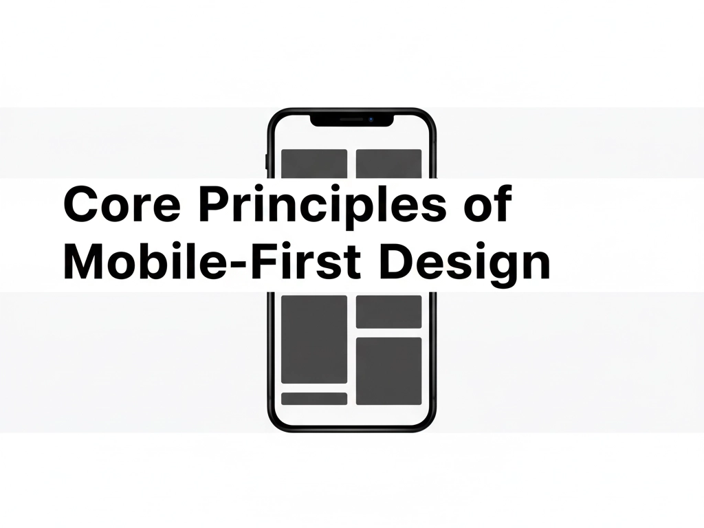
Core Principles of Mobile First Design
Building for mobile is about more than just making things smaller. It is about understanding the physical way people interact with a screen using their hands.
Simple Functional and Touch Friendly Layouts
On a desktop, you have a mouse for precision. On a mobile device, you have a thumb. A custom web design must account for the touch zone. This means buttons need to be large enough to tap easily and spaced far enough apart that you do not accidentally click the wrong link. If your layout is cluttered, the user will feel frustrated and leave.
Clear Visual Hierarchy and Content Prioritization
You have very little space on a mobile screen. You cannot show everything at once. This forces you to decide what matters most. Is it your phone number? A book now button? Your main service? By placing the most vital information at the top, you guide the user toward the action you want them to take. This is the heart of effective website design and development services.
Optimized Calls to Action and Smooth Navigation
A call to action is the button that tells the user what to do next. On a phone, these need to be bold and easy to find. Navigation should also be simplified. Instead of a massive menu with twenty links, use a clean menu icon that stays out of the way until it is needed. This keeps the focus on the content and makes the journey through your site feel natural.
How to Implement a Mobile First Design for your website in egypt
If you are running a business in Egypt, the mobile experience is not just a trend; it is the primary way your customers find you. From Cairo to Alexandria, people rely on their smartphones to find local services and shop online. But the local digital landscape has specific challenges that your mobile first design strategy must address.
Research Your Audience and Mobile Use Cases
Do you know which phones your customers actually use? In Egypt, many users rely on budget friendly smartphones that may not have the processing power of the latest high end devices. When you invest in website design and development services, you need to ensure your site is built for the actual devices your customers hold. This means testing on various screen sizes and making sure the site performs well even on slower mobile data connections.
Build Wireframes and Prototypes for Mobile Screens
Instead of sketching a big desktop layout, start with a narrow vertical rectangle. This forces you to think about what is strictly necessary. If a feature does not fit on a mobile wireframe, ask yourself if it really needs to be on the site at all. This stage of web design and development is where you decide how a user will navigate your services using only their thumb.
Apply Mobile First UI UX Principles and Test Rigorously
User experience is about how the site feels. Is the text legible under the bright Egyptian sun? Are the buttons easy to tap while someone is on the move? Testing is the only way to know for sure. You should try to use your site in real world conditions, like while walking or in areas with patchy signal, to see where the experience breaks down.
Optimize for Speed Accessibility and Responsiveness
Speed is a critical factor for success in the local market. If your site is heavy with large images, it will frustrate users who are not on a steady wifi connection. By focusing on responsive web design that prioritizes light assets, you make your site accessible to everyone. This ensures that a customer in a rural area has the same quality experience as someone in the heart of the city.
Mobile First Design Best Practices
As we move through 2025, the standards for what makes a good website continue to rise. Users expect instant results and zero friction.
Maintain Fast Loading and Lightweight Elements
The days of waiting five seconds for a page to load are over. To stay competitive, your custom web design must be lean. This involves using modern image formats and clean code that does not bog down the browser. When you reduce the weight of your pages, you improve the experience for the user and make it easier for search engines to crawl your content.
Design for Touch and Small Screen Interactions
Think about the "thumb zone." Most people use their phones with one hand. This means the most important buttons should be within easy reach of a thumb near the bottom or middle of the screen. In the world of mobile first website design, placing a main menu button at the very top left can be a mistake because it is hard to reach.
Continuously Monitor and Improve Based on User Data
A website is never truly finished. Once your site is live, you should look at the data to see where people are getting stuck. Are they leaving the checkout page? Are they failing to find your contact info? Use these insights to tweak the design. The best website design and development services are those that adapt based on how real people actually use the site.
Ready to Upgrade? Transform Your Website with Mobile First Design
Your website is usually the only chance you have to make a good impression. If a customer opens your page on their phone and finds a cluttered mess, they will not give you a second chance. They will simply go back to the search results and find a competitor who made the process easier.
Choosing a mobile first design strategy is about more than just modern technology; it is about how you treat your customers. Whether you need custom web design or a total rethink of your web design and development, the goal is to remove every obstacle for the person holding the phone. When you make your site easy to navigate with one hand, you show your audience that you value their time.
Try this right now: open your own site on your phone. Can you find your contact information or a specific service in under five seconds? If the answer is no, your site is likely costing you business. Focus on the mobile user first, and the rest of your digital presence will fall into place.
E-commerce Mobile App Design in Egypt
eccommerce mobile app design in Egypt converts 3x better than websites through one-tap checkout, push notifications (boosting reorder rates 41%), and offline browsing mobile apps captured 90% of Black Friday sales volume last year per industry benchmarks. Essential features include thumb-friendly bottom navigation (3 buttons max), 0.3s skeleton loading screens, swipe-to-cart animations, live inventory sync, and AR try-on that work seamlessly with local payment gateways like Fawry. Build apps alongside mobile-first websites using shared design systems dual-platform customers spend 2.1x more per Statista e-commerce data.